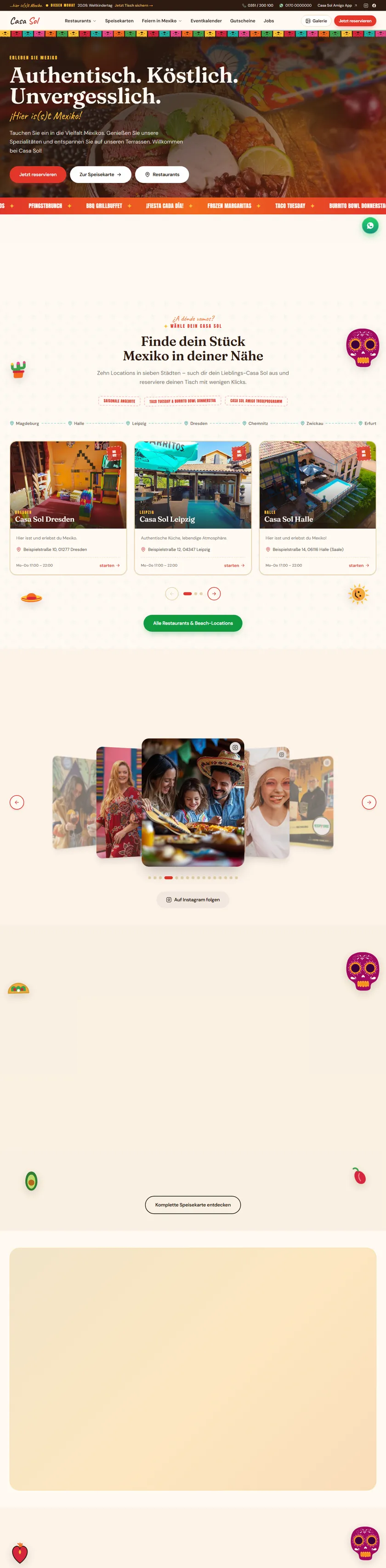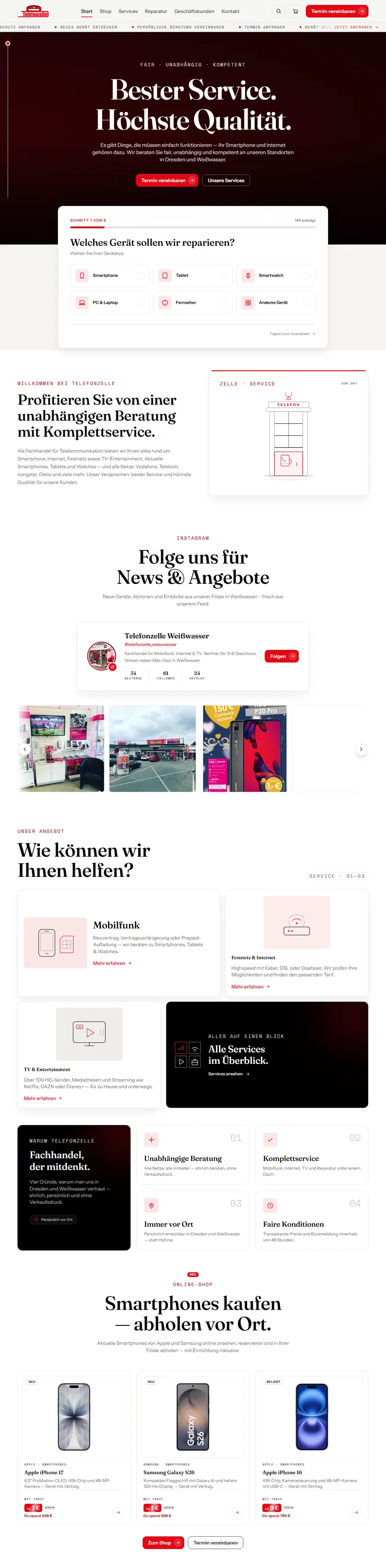
01Before
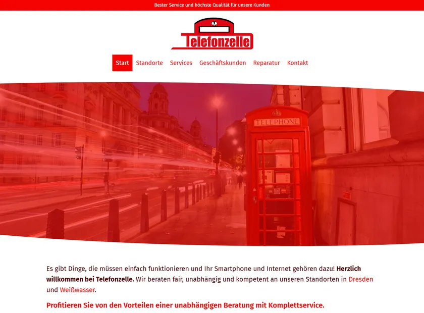
This is what customers saw.
Red header, red banner, red photo, red links. Six menu items, one paragraph and no idea where to click.
telefonzelle-dresden.deBefore
02Findings
- 01
Six menu items. None of them says “fix my phone”.
- 02
Everything is red, so nothing stands out.
- 03
The first thing you read is a paragraph, not a button.
- 04
On a phone you scroll, scroll… and call.
The old website explained a lot but led nowhere: no clear path to a repair request, no appointment, no structure on a phone. Anyone with a broken device had to call.
03The turn
So we reduced it to what matters.
Three goals- 01
A repair request in under a minute
- 02
An appointment button that never disappears
- 03
Built for the phone first
- Redesign & relaunch
- Six-step repair assistant
- Appointment booking
- Location pages for Dresden & Weißwasser
- Performance & SEO